Kickstart your web app's color palette
Color is a big deal in UI design. It’s an unavoidable part of the brand you’re designing for, and it’s a very powerful tool to control hierarchy – to make key elements look important and others, insignificant.
So let’s say you’re early in the design process, and stuck figuring out good colors (like it happens to me, all the time).
Here’s the little foolproof process I use to get back my momentum.
Variants and contrast
First off, you have to have legibility. Your color choices are the foundation for pleasant contrast within the whole interface.
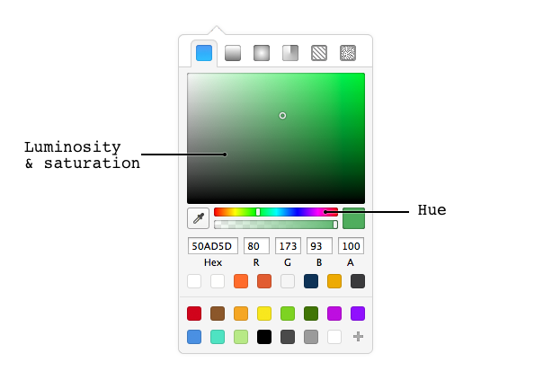
So how do you get a bit brainy about contrast, and actually think through your choice? The best way to analyze it is by considering each color through three characteristics it has:
- Its hue. Is it red, green, purple? The color, basically.
- Its saturation. Is the hue vivid, or subtle, or nonexistent (gray)?
- And its luminosity. How close is this color to being completely white (full luminosity) or completely black (none)?
Chances are you know a bit about this color system. It’s called HSL (or HSB), and it’s a standard in design apps. It’s even the default picker in Sketch.
What you’ll want to do first is to pick a main color, just one. It may be part of the brand, or something befitting of the personality you’re after. Most of the time, your main color will have average to high saturation, and luminosity almost dead-center.

To create your contrasting colors you’ll vary a limited number of HSL axes. Your best bet is to leave hue identical across all swatches for now. If your main color is bright, create a swatch with very low luminosity, it’ll be your dark variant. Then make another that has very high luminosity and pretty low saturation, for light elements.
You’ll have to toy with these a bit, don’t feel bad about it. As soon as you have 2-3 colors that contrast well and look good together, you should feel much less stuck.

Picking a color and some contrasting variants is the best way to get to a functioning palette soon. Go and do it, I’ll wait.
Note: If you’re a developer and don’t want to dive in these graphic design tool shenanigans, I suggest Brandon Mathis’ great HSL Picker . The sliders are in the expected order, with transparency as the fourth should you need it.
Secondary colors
Better to have more than one color, right?
Secondary colors bring strong contrast to your interface. Don’t abuse them, and pay attention to how they affect the overall balance of your design. A contrasting hue is one of the most influent tools you have to create visual importance.
Play it easy, and limit the amount of different hues across your interface. Pick a secondary color, some variants, see how far you can run with it.

And you know what? At this point, you’re pretty much unstuck. Two colors with their variants will take you a very long way .
From here on, it’s all about fun and practice! In time, experience and a familiar understanding of color theory will even allow you to make great choices that break the rules.
PS: since you’ve got this HSL thing down now, here’s a cool, easy thing to avoid burning eyes: don’t overlap colors that have similar luminosity. Even if your palette is great: